The Colour Sample Before the Paint Pot
A colour sample helps you compare undertones, daylight, and furnishings at home, so you can choose paint with a clearer sense of how it will read.
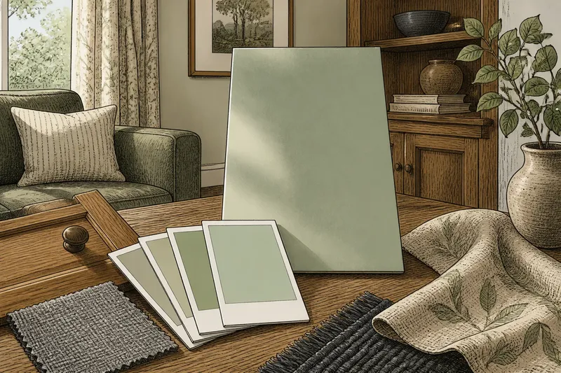
A paint colour sample can look quiet on a chip and unexpectedly bold across a wall. Use a colour sample to compare paint with the room’s light and existing finishes before choosing a full-wall colour; the small card is a starting point, not a miniature preview.
A chip is useful for narrowing options, while a larger painted area reveals more about scale and context. Neither can reproduce every quality of a finished room, but together they can help you spot undertones and decide which colour deserves a closer look.
What Samples Reveal
Paint chips compress a colour into a small area surrounded by a printed border. That makes them easy to carry and compare, but the border, paper surface, and nearby colours affect what stands out. A gray may seem cooler beside warm beige and more neutral beside blue-gray.
Use a chip to ask focused questions:
- Does the colour lean yellow, red, green, or blue? If one undertone clashes with the fixed finishes, compare another chip; if it works beside them, keep it in the running.
- Does the colour feel muted or clear beside the room’s fabrics and surfaces? If it seems too sharp, consider a less saturated option; if it feels balanced, move to a larger trial.
- Does the colour remain comfortable in the available daylight? If it shifts in a way you dislike, test another option; if the shift suits the room, keep observing it.
- Does it sit well with tile, flooring, or cabinetry that will stay? If it competes with a permanent finish, set it aside; if it complements that finish, carry it forward.
- Does the chip look different when viewed alone rather than in a cluster? If neighboring chips obscure its undertone, compare it separately; if its character remains clear, record your impression.
- Does the printed border influence the first impression? If the border makes the colour seem unlike itself, judge it on a larger painted board; if not, use the chip for initial comparison.
A sample cannot show exactly how a large, continuous surface will feel. For that, make more of the colour visible.
Why Scale Changes Colour
On a small swatch, the eye takes in the colour alongside its edges and surrounding colours. A painted wall presents a much larger field with fewer visual interruptions. The colour can seem more prominent, and subtle undertones may become easier to notice.
Room conditions add to the difference. A wall facing a leafy yard may pick up a green cast in daylight; warm wood can make a nearby cool colour feel sharper. In a dim corner, a mid-tone may seem heavier than it did near a bright window. These impressions come from the colour, the surface, and what surrounds it.
Use a chip to narrow possibilities, then view a finalist on a larger painted board.
From Chip to Wall
Collect paint chips in the room where the colour will be used. Compare them with permanent finishes and fabrics that will stay in place. Look at each chip on its own as well as in a group: similar colours side by side can make undertones harder to spot.
For a more useful trial, paint a portable board or a sheet made for paint. Keep its surface as close as practical to the wall’s finish, and avoid judging only a tiny dab. Move the board between a spot near a window and a darker part of the room. This lets you compare conditions without painting several test patches directly onto finished walls.
Observe the sample at ordinary times of use. Check it in morning light, later daylight, and the room’s usual evening lighting. Compare it with the objects that will remain, such as a sofa fabric, curtain, wood cabinet, or artwork. If a colour only works when held beside a chip, it may not suit the larger field.
Say you are considering a pale green for a living room with honey-coloured oak and a charcoal rug. On a chip, the green seems nearly neutral. You paint a portable board with that sample, move it from the window wall to the darker corner, and compare it with the oak. The board makes the green’s undertone easier to notice; beside the oak, it reads warmer. If you like that shift, keep the colour in consideration; if not, compare a less green or more muted option.
Reading Room Cues
Light changes both brightness and colour impression. A north-facing room may receive cooler-feeling daylight, while direct afternoon sun can make a colour appear warmer or more intense for part of the day. These are tendencies, not fixed rules: window size, nearby buildings, trees, and interior lighting all affect what reaches a wall.
Look at the sample in the room’s actual conditions rather than inferring the result from a store display. If you use warm-white bulbs in the evening, judge the sample under those bulbs. If lamps and overhead lights differ, check the sample where each source reaches it.
Consider the wall’s neighbors, too. A bright white ceiling may make a muted wall colour seem deeper by contrast. Strongly coloured curtains can cast reflected light, while a patterned rug may introduce competing hues. You do not need to match every object, but note which nearby colours will remain visually prominent.
Choosing a Trial Method
Each sampling method answers a different question. A manufacturer’s chip is convenient for comparing options and carrying alongside fabric or flooring samples. A painted board offers a larger, movable view of the actual paint. A test patch on the wall shows the paint in place, but it is less flexible and can be difficult to cover neatly if you repeat the trial.
Check the paint label and manufacturer’s instructions for suitable products, surfaces, and application. For a movable board, write the colour name and finish on the back so the sample stays connected to its details.
Choose the least intrusive method that answers your current question. Use chips to compare undertones; use a larger painted area to judge scale and changing light.
Questions About Colour Samples?
How large should a paint sample be?
Make it large enough to read as a field of colour rather than a small mark, and use a painted surface similar to the wall when practical. A movable board lets you assess a generous area without leaving test patches behind.
Should I sample paint on the wall or on a board?
A wall patch gives a direct view in place, while a board is easier to move between light conditions and nearby finishes. Pick the option that answers your main question and suits the room’s existing surface.
Why does a paint chip look different at home?
Store lighting, a printed border, and neighboring colours can all affect the first impression. At home, daylight, lamps, furnishings, and a larger viewing area change the visual context.
Can a sample show the final wall colour exactly?
No small chip or trial area fully recreates a finished wall, where a continuous surface dominates the room. A sample is most useful for spotting likely undertones and deciding whether a colour deserves further consideration.
A Clearer Paint Choice
Keep the final contenders together with the room’s fabric and finish samples. Write down what each one looks like near the window, in a darker corner, and under the evening lights you normally use. These notes make comparisons clearer when impressions begin to blur.
A colour sample is a way to ask the room a better question, not a miniature version of the finished space. Use the colour sample to compare a short list of plausible choices under the light and beside the materials they will actually meet; then choose the next trial based on what you can see.